
KB Capital Group: Fix & Flip Loan Newsletter Redesign
- Industry
- Loan / Finance
- Services
- Custom Newsletter Design • Campaign Graphics
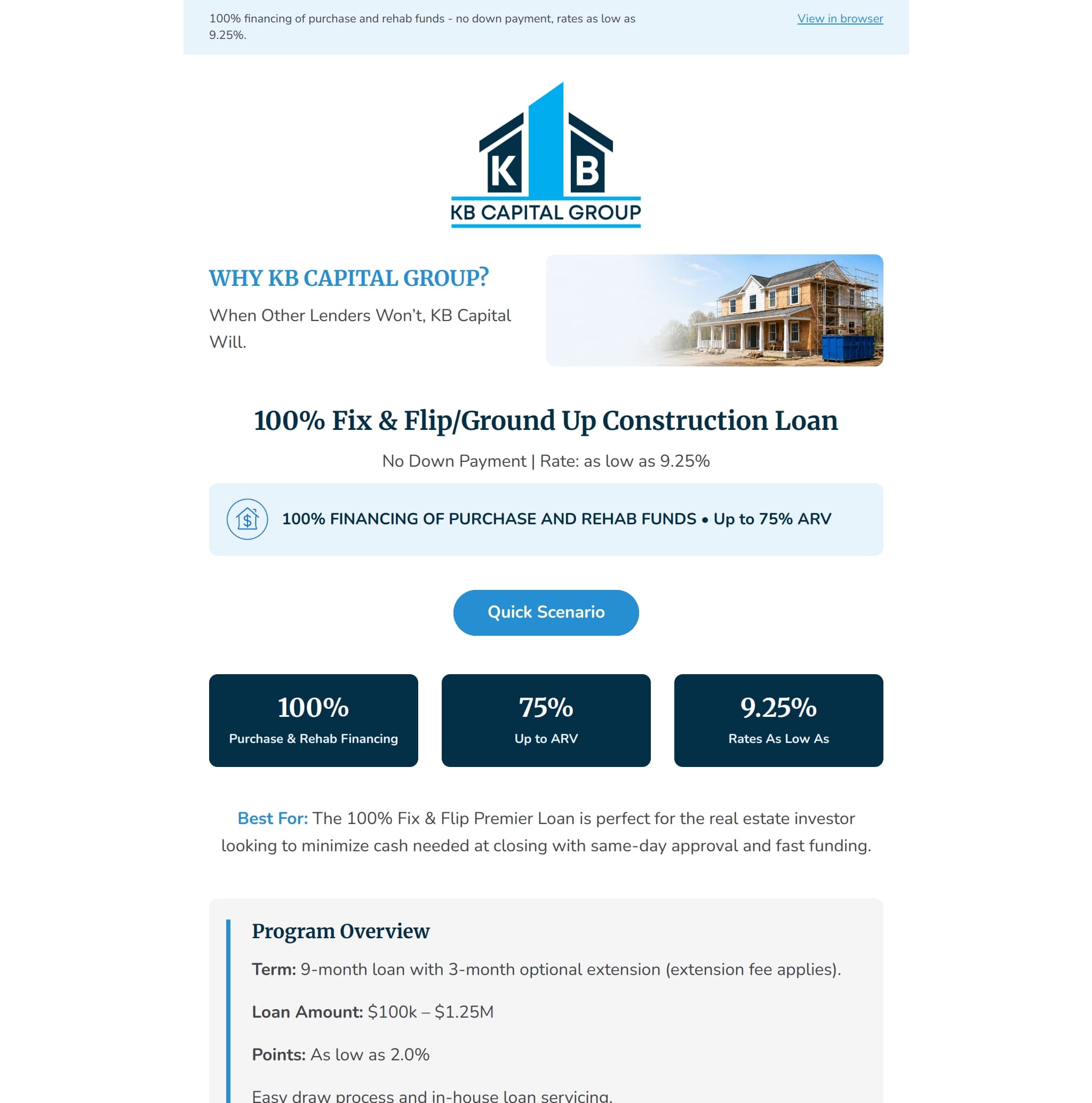
A before-and-after redesign of KB Capital Group’s Fix & Flip loan newsletter, reorganizing a dense promotion into a clearer, responsive email with stronger hierarchy, scannable loan details, live text, and more visible calls to action.
Overview
KB Capital Group is a real estate lender offering financing programs for property investors. This project redesigned an existing promotional email for the company’s Fix & Flip Premier Loan. The original email contained the necessary program information but presented much of it in large, dense sections with limited visual hierarchy. The redesign preserved the core offer and qualification details while reorganizing the campaign into a clearer, more professional email experience for real estate investors.
- Goal
- Redesign the Fix & Flip Premier Loan email so real estate investors can quickly understand the offer, evaluate basic qualification requirements, and submit a loan scenario without navigating a crowded or overly dense layout.
- Audience
- Real estate investors, property developers, fix-and-flip operators, and borrowers seeking purchase, rehabilitation, or ground-up construction financing.
Design Approach
- Challenge
- The original newsletter placed several important messages - loan terms, financing limits, borrower qualifications, service benefits, and the primary CTA - at similar levels of visual importance. This made the email harder to scan and pushed the main action toward the bottom of a long campaign. Dense copy blocks, limited spacing, and a largely text-based layout also made it difficult for readers to identify the offer’s most important details quickly. The redesign needed to: 1. Clarify the primary loan offer immediately 2. Make key financing figures easy to scan 3. Present detailed loan information without overwhelming readers 4. Improve the mobile reading path 5. Give the primary CTA stronger visibility 6. Maintain KB Capital Group’s established blue brand identity 7. Preserve essential information as live HTML text 8. Keep required contact and unsubscribe information accessible
- Content Hierarchy
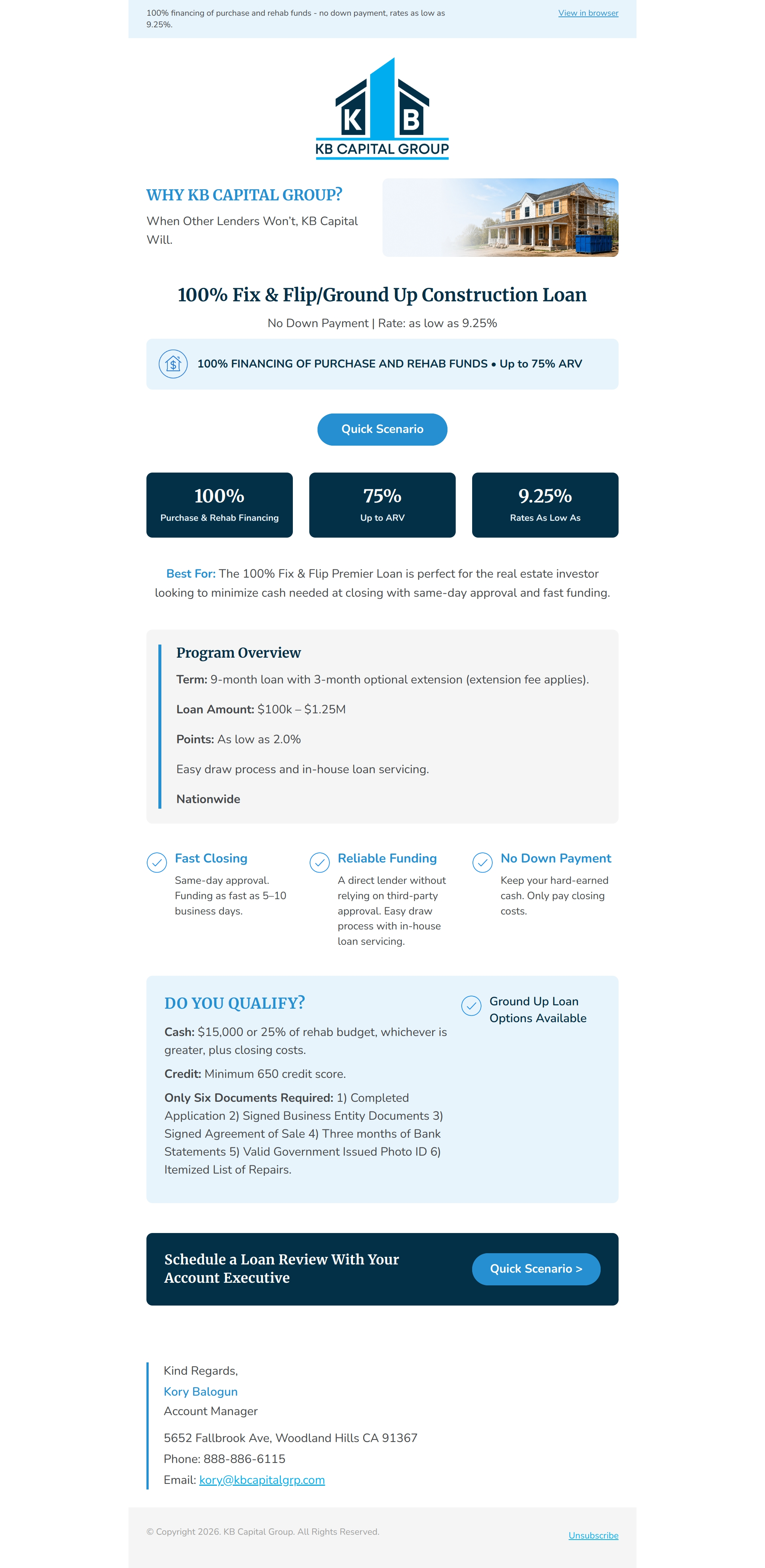
- The redesigned email follows a focused decision path: 1. Brand recognition and sender context 2. Primary Fix & Flip loan offer 3. Financing and rate highlights 4. Early Quick Scenario CTA 5. Key loan metrics 6. Best-fit borrower description 7. Program overview 8. Lending benefits 9. Borrower qualification requirements 10. Final loan-review CTA Account manager contact details Unsubscribe and footer information
- Visual Direction
- The redesigned newsletter uses KB Capital Group’s established navy, cyan, white, and pale-blue palette. Dark navy metric and CTA sections create strong contrast, while light-blue surfaces separate supporting information without making every module compete for attention. A residential renovation image reinforces the lending context, and restrained icon use supports scanning without making the email image-dependent. The overall direction is professional, direct, and trustworthy, with a stronger emphasis on financial clarity than decoration.
- Reusable Modules
- The campaign was structured as a reusable lending template with modules for: 1. Branded header 2. Contextual hero image 3. Loan headline and supporting terms 4. Financing callout 5. Primary CTA 6. Metric cards 7. Borrower-fit summary 8. Program overview 9. Benefit columns 10. Qualification panel 11. Final CTA banner 12. Account manager signature 13. Compliance footer The same structure can support future loan products by updating the program name, rate information, eligibility requirements, benefits, imagery, and destination links.
- Result
- The redesign turns a dense promotional email into a clearer loan-marketing experience. Readers can identify the primary offer and important financing figures near the top, review program details in structured sections, and access the Quick Scenario action at two logical points in the campaign. The final design improves readability, mobile scanning, brand consistency, and CTA visibility while retaining the substantive loan information supplied by KB Capital Group. No campaign-performance improvement is claimed unless supported by verified send data.
Full Newsletter Preview
Responsive Views
Designed to look beautiful on every screen.

Key Design Features
Responsive HTML email structure
Live-text loan terms and qualification information
Early primary CTA placement
Repeated CTA for longer-email readers
Scannable financing metric cards
Purposeful property-renovation imagery
Structured program overview
Mobile-friendly benefit modules
Distinct qualification section
Descriptive image alt text
Visible sender contact information
Accessible unsubscribe placement
Recognizable brand colors and typography